Don’t Use Lengthy Registration Forms
Anything you require your visitors to do, creates a barrier between you and them. Think about what your response is when you are asked to complete a form with lots of questions. Either you ignored it and clicked away or like me, you entered bogus data.
Registration forms are not fun because people have to invest their time and effort to register. Then they have to try to remember what user name and password they used.
You need to make your sign-up form as short as possible. All you really need from your registration’s is to be able to identify each user. You really only need a unique identifier, such as a user name or email address, and a password. If you don’t need more information, don’t ask for it. Keep your form short.

ReadOz’s Form is Too Lengthy
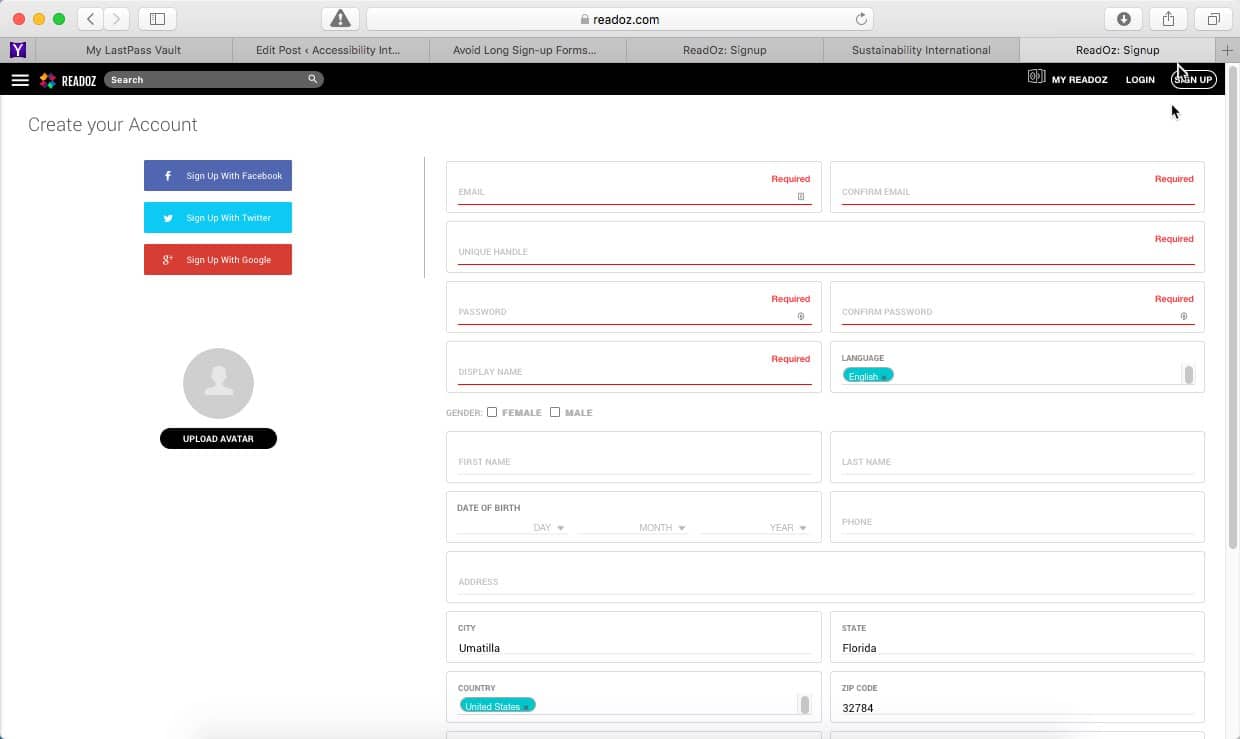
A great example of an overly long registration form is the one on ReadOz’s website. If you look more closely at their form, you discover that the majority of the fields are optional.
If so many fields are optional, they don’t really need to be there. Using a form like this would likely scare off a user seeing it for the first time. Ask only what the person needs to register, gather the rest of the information later.

Tumblr’s Form is Only 3 Questions
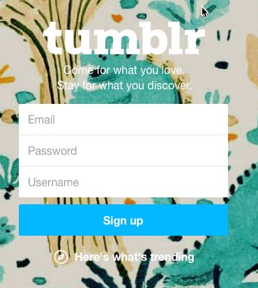
A great example of a short registration form, Tumblr’s form is one of the shortest sign-up forms around. It has just three fields, asking for a visitor’s email, password and user name.
Tumblr get’s it, they understand how much more effective a short form is. Can you make your form even shorter than Tumblr’s?

Basecamp’s Form Has Only 1 Question
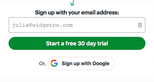
The Basecamp sign-up page is great, only one question to start. Basecamp engages and informs their visitors. They even include answers to FAQ’s immediately below their form. Doing this removes visitor’s distractions and helps keep them focused on the form. They work hard to remove all your objections thus making your sign-up the logical result.
Usability Makes Things Easier
Usability is all about making your site easier to use. Requiring less thinking by your visitors, resulting in less frustration. Your website should do all the work and present visitors only with the things they’re looking for.
Usability is About Your User Experience
Usability is also about the experience people have using your website, so attention to detail matters, as do the presentation and feel of the page. Try to emulate Basecamp’s great sign-up page and monitor your results. Less can be better.


